Activities
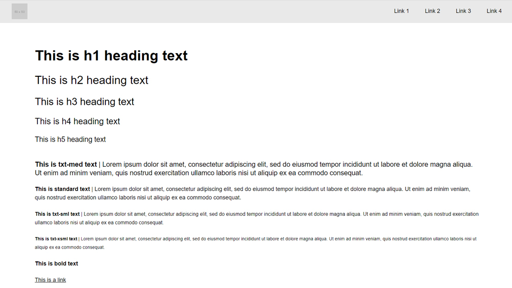
Responsive Fonts
The base font size variable --html--font-size is controlled using the Font Media Queries in the colony-style.css file. This maintains the proportions of font sizes, line heights & letter spacing so custom code is only required if the relative proportions need to change for a given breakpoint.
Any custom CSS should be added to the style.css file & relative values should always be used in place of absolute values.

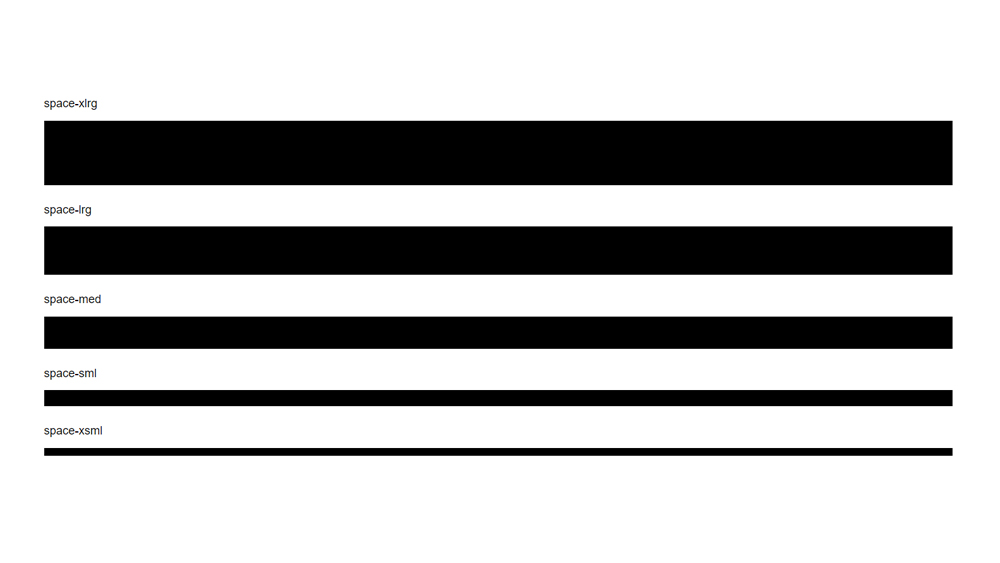
Responsive Spacing
The base space variable --space is controlled using the Spacing Media Queries in the colony-structure.css file. This maintains the proportions of all elements that use the Utility Spacingvariables so custom code is only required if the relative proportions need to change for a given breakpoint.
Any custom CSS should be added to the style.css file & spacing variables should always be used in place of absolute values.

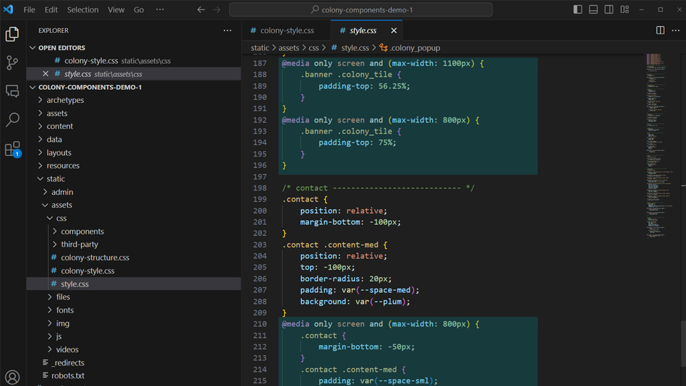
Responsive CSS
Our projects do not use a responsive.css file. All media queries should be added to the style.css file at the bottom of the relevant website section. For example all Homepage related media queries should sit at the bottom of the Homepage section of the CSS, all Footer related media queries should sit at the bottom of the Footer section and so on.
Media queries within each section should then be ordered from largest screen size to smallest. Because our projects are 'desktop first' only (max-width: XXX) media queries should be used (no min-width).

