Activities
Review Design File
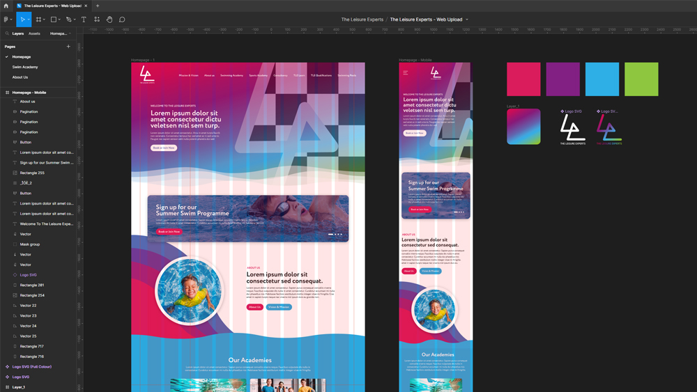
Use the Adobe XD or Figma design file to determine the spacing, text, colors and appearance of common website elements that will be required in the project. Be mindful that there may be errors in the design file so there will be a degree of interpretation in this step.
Add Custom Fonts
Custom fonts should be added by either by linking to an external stylesheet such as Adobe Fonts and Google Fonts or by saving the font files in the appropriate folder & using a @font-face import.
Once fonts are added they should be set as variables in colony-style.css for use within your CSS.
@import url('https://fonts.googleapis.com/css2?family=Open+Sans:ital,wght@0,300;0,400&display=swap');

:root {
    --openSans: 'Open Sans', sans-serif;
}
Text Variables
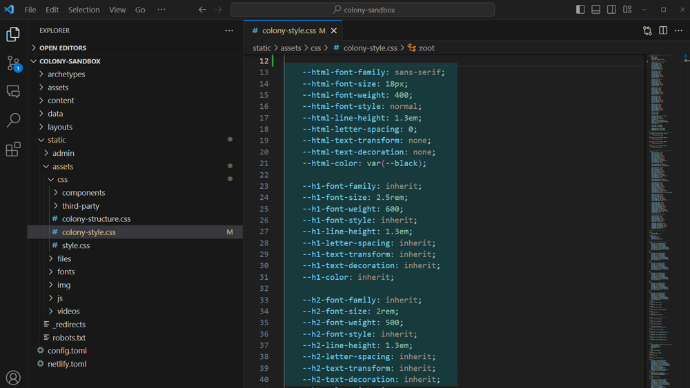
Set the HTML Font Styles for the project in colony-style.css. The base HTML font-size & other styles should match those used for body text in the desktop version of the design file.
Set the Heading Font Styles (H1 - H6) in colony-style.css to match the desktop version of the design file.
Set the Font Media Queries to adjust the base HTML font-size for different breakpoints. First set the base size in the smallest media query (501px) to the size of body text in the mobile version of the design file. Then adjust the size in the other media queries accordingly to give a smooth transition from the desktop font-size to the mobile font-size.
Color Variables
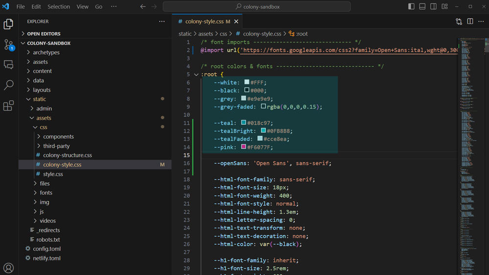
Add all colors as variables in colony-style.css by taking the HEX codes or RGB values from the design file. Where other elements utilise these colors always use the variable instead of declaring the color absolutely.
Set the Utility Classes for Text txt-1 txt-2 txt-3 and Backgrounds bg-1 bg-2 bg-3
Spacing Variables
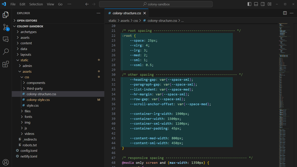
Set the Spacing Sizes in colony-structure.css to match the desktop version of the design file.
The baseline space is set using an absolute value in px. The 5 main spacing sizes
Set the Other Spacing Variables in colony-structure.css to match the desktop version of the design file.
Set the Spacing Media Queries to adjust the spacing sizes for different breakpoints. First set the base size in the smallest media query (501px) to match the mobile version of the design file. Then adjust the size in the other media queries accordingly to give a smooth transition from the desktop spacing to mobile spacing.
Other Elements
Set the Common Element Variables in colony-style.css to style items such as links, buttons and forms to match the design file.
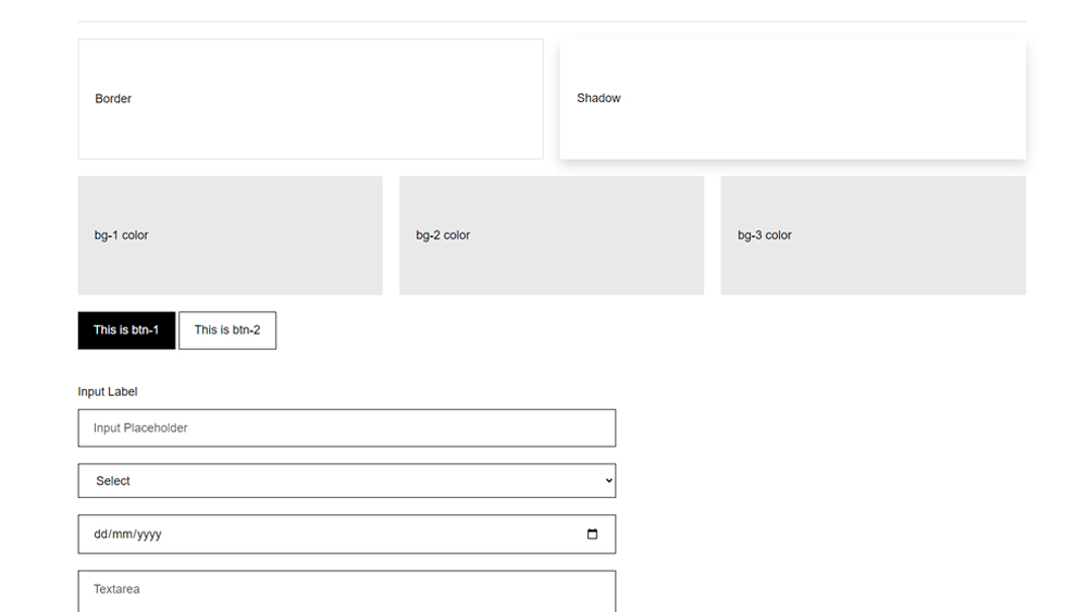
All projects contain a preview.html file which can be used to visualise the elements while you are styling. Not all elements will be present in the design file so you only need to configue those that will be used at this stage.
