Video Overview
A look at how to customise components to match the style of the target website.
CSS Customisation
Most styling alterations can be achieved with only CSS amendments. These changes should always be made in the style.css file as opposed to the individual component CSS files. Files are loaded so that statments in your custom code will always take precendence over the original component styles.
CCS Targeting
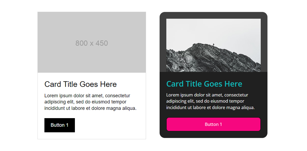
Combine Component Class or Category Class with the Internal Class you would like to target.

.colony_card_1 {
    border-radius: 20px;
}
.colony_card_1 .head {
    padding: var(--space-sml);
    padding-bottom: 0;
    background: var(--charcoal2);
}
.colony_card_1 .head img {
    border-top-left-radius: 10px;
    border-top-right-radius: 10px;
}
.colony_card_1 .title {
    color: var(--teal);
    font-weight: 600;
}
.colony_card_1 .body {
    background: var(--charcoal);
    color: var(--white);
    font-size: 0.9rem;
}
.colony_card_1 button {
    width: 100%;
    background: var(--pink);
    border-radius: 10px;
}
Responsive
Components often have some basic responsive CSS already included in their associated stylesheets. To expand on this or override the standard responsive styling you can combine the CSS Targeting approach above with a custom media query.
@media only screen and (max-width: 800px) {
    .colony_card_1 .head {
        padding: var(--space-xsml);
        padding-bottom: 0;
    }
    .colony_card_1 .body {
        padding: var(--space-xsml);
    }
}
HTML Customisation
Components have a simple and intuitively labelled HTML structure and are designed to be customised when required. You can add or remove items directly in the HTML (or even nest other components) and combine with suplementary CSS to achieve your desired result.
Adding HTML
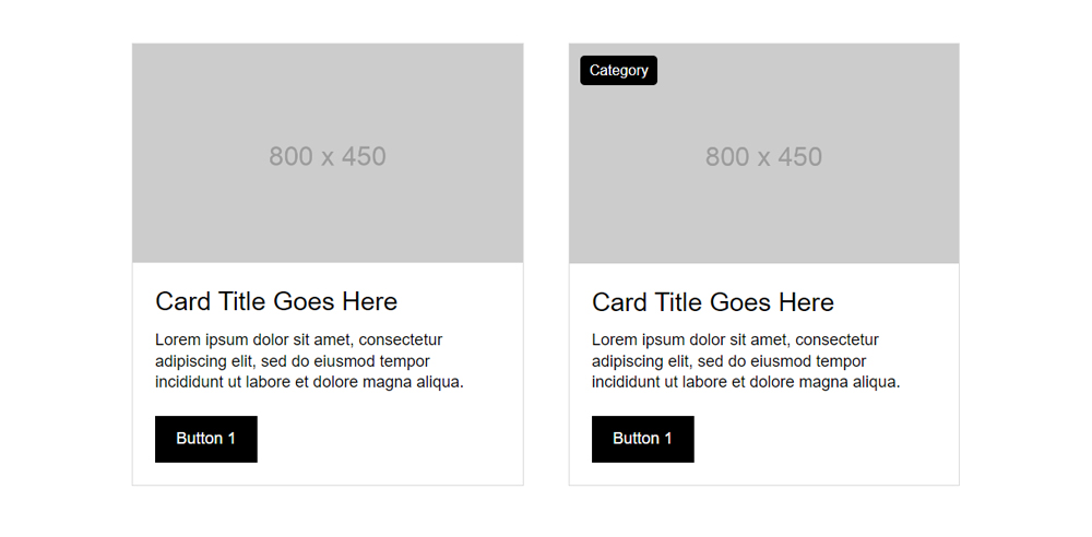
In the example below a new category element has been addded to the head section of a colony_card_1 and combined with some simple CSS to introduce a label to the card.

<div class="head">
    <div class="category">Category</div>
    <img src="https://via.placeholder.com/800x450" alt="" class="w100">
</div>
.colony_card_1 .head {
    position: relative;
}
.colony_card_1 .category {
    position: absolute;
    top: var(--space-xsml);
    left: var(--space-xsml);
    padding: 5px 10px;
    border-radius: 5px;
    background: var(--black);
    color: var(--white);
    font-size: 0.9rem;
}
Removing HTML
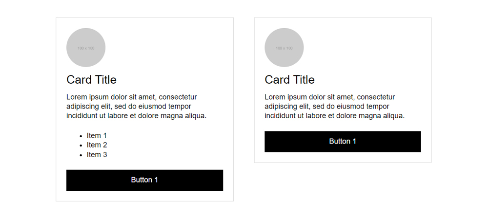
In the example below the ul element has been removed. This could be achieved either by removing markup completely or if the element may be required later, then it could be commented out instead (or hidden with CSS).

<div class="colony_card colony_card_2">
    <div class="head">
        <img src="https://via.placeholder.com/100x100" alt="" class="w100">
    </div>
    <div class="body">
        <div class="title">Card Title</div>
        <div class="content">
            <p>Lorem ipsum dolor sit amet, consectetur adipiscing elit, sed do
                eiusmod tempor incididunt ut labore et dolore magna aliqua.</p>
            <!--<ul>
                <li>Item 1</li>
                <li>Item 2</li>
                <li>Item 3</li>
            </ul>-->
            <button class="btn-1">Button 1</button>
        </div>
    </div>
</div>
Nesting
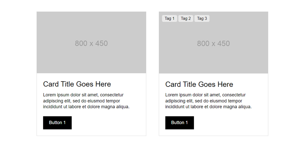
In the example below a colony_tags element has been nested into to the head section of a colony_card_1 and combined with some simple CSS to introduce a label to the card.

<div class="grid-item grid-item-b">
    <div id="example" class="colony_card colony_card_1">
        <div class="head">
            <div class="colony_tags">
                <span class="colony_tag">Tag 1</span>
                <span class="colony_tag">Tag 2</span>
                <span class="colony_tag">Tag 3</span>
            </div>
            <img src="https://via.placeholder.com/800x450" alt="" class="w100">
        </div>
        <div class="body">
            <div class="title">Card Title Goes Here</div>
            <div class="content">
                <p>Lorem ipsum dolor sit amet, consectetur adipiscing elit, sed do
                    eiusmod tempor incididunt ut labore et dolore magna aliqua.</p>
                <button class="btn-1">Button 1</button>
            </div>
        </div>
    </div>
</div>
.colony_card_1 .head {
    position: relative;
}
.colony_card_1 .head .colony_tags {
    position: absolute;
    top: var(--space-xsml);
    left: var(--space-xsml);
}
Javascript Customisation
Unlike HTML or CSS amendments there is no pre-defined process for Javascript customisation as the requirements will vary from project to project. However Javascript amendments should be made either directly in the components associated xxxxx.js file (if already present in static/assets/js/components) or customisations should be made in main.js if not.
