Repository Structure
A look at the structure and directory usage of the Components repository.
Component Tiles
Tiles are created via markdown files stored in the content folder. Components are organised in sub-folders within this directory, first by component type and then by component category. Each component tile then has an individual markdown file with its name within the relvant sub-folders.
The Markdown files contain various attribites that reference the components HTML, preview image, installation instructions and supporting files to add the actions to each tile.
HTML
The HTML for each component is stored as a Partial in the layouts/partials folder. Components are organised in sub-folders within this directory, first by component type and then by component category. Each component tile then has an individual .html file with its name within the relvant sub-folders.
Every partial also has a corresponding Shortcode in the layouts/shortcodes folder. This file will have the exact same sub-folder parth as it's partial counterpart and contains only a reference to the partial.
Supporting Files
The supporting CSS, Javascript and JSON files for each component are stored in the static/assets folder & then within the relevant sub-folder for that asset type. Within each asset type folder there is a components folder that hold all supporting files.
For example CSS files would be stored in /static/assets/css/components.
Preview Images
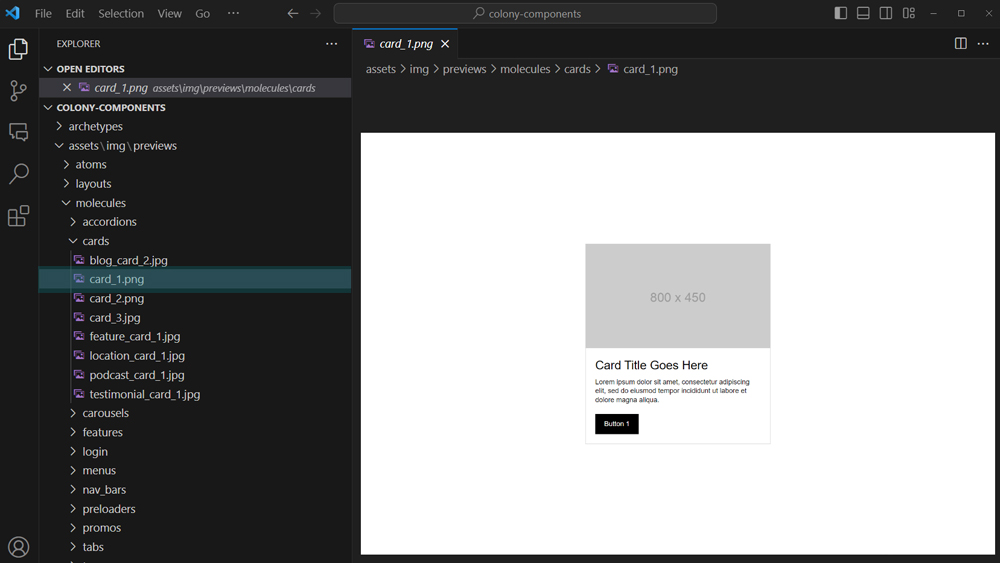
Greyscale preview images of the visual appearance of each elements are stored in the assets folder as JPEG's. Images are organised in sub-folders within this directory,
first by
Filters
Filters in the Component Library are controlled via config files in the data folder. The component type filter is controlled via the filters.json file and the component categories filter is controlled via the categories.json file.
Development Best Practice
A look at how to create new components and development standards.
Development Environment
Components should be created using clean version of our latest standard Project Repository. Standard practice is to comment out the header & footer partials to give blank slate for development. Using a COLONY project repository ensures that the Framework is available during development and also means that created components will display the same as they will for end users that download them to their COLONY project in the future.
Framework Usage
Components should be built using the Framework as a basis utilising variables and supported elements. Items such as containers and grid can be nested inside components where appropriate and can be customised via CSS to give the desired look and feel. Components should however avoid using the Framework shorthand classes to keep most styling self-contained in their accompanying CSS files.
Styling
Minimal styling with customisation in mind. Components should be monochrome, using only the preset white, black, grey and grey faded colors in the framework. Avoid bold design choices, focus instead on layout, positioning and structure of elements as most styling with be added via the destination theme and customisation.
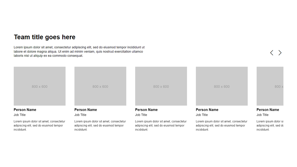
Component Classes
All components should be created in line the standard Types & Structure. Components are wrapped in a unique Component Class and pre-fixed with colony_ to avoid infringing on any existing items on the site, for example colony_card_1. This class is unique to the component and should always be added to the outer most div in the HTML
<div class="colony_card_1">
    <!-- component content -->
</div>
Some components are also wrapped in a Category Class, when present this is also pre-fixed with colony_ to avoid, for example colony_card. Multiple components in the same category can share this class and this should be added to the same div as the Component Class.
<div class="colony_card colony_card_1">
    <!-- component content -->
</div>
Internal Classes
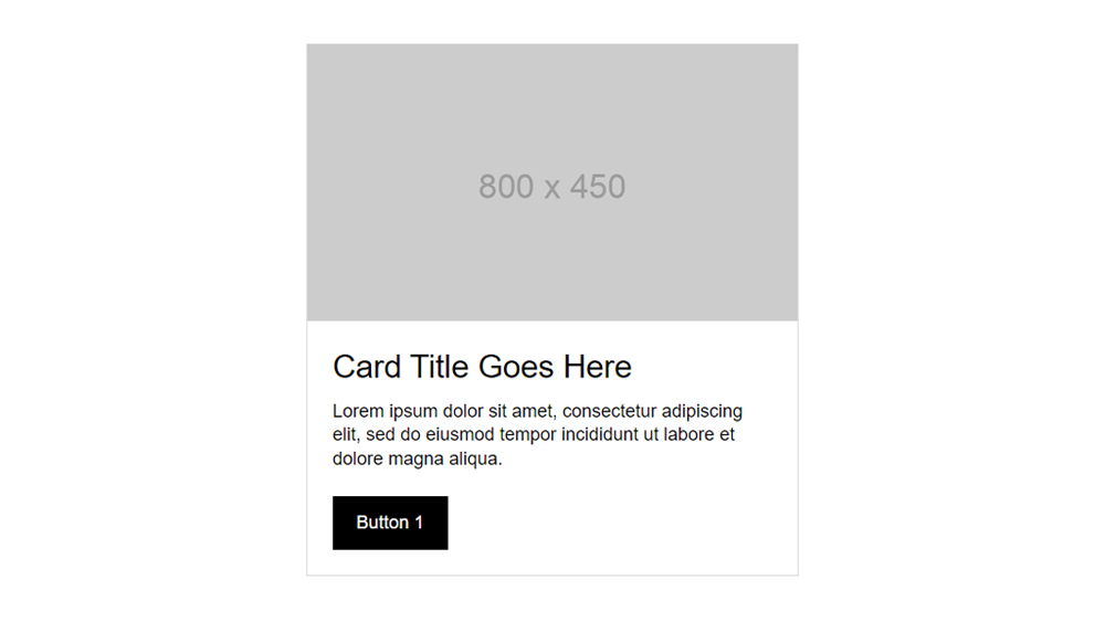
Inside the component all classes short have short (1-2 words) inuitive naming with no prefix, for example head body title or content. These classes are common and often repeated across components, so review similar elements and reuse classes where appropriate.
<div class="colony_card colony_card_1">
    <div class="head">
        <img src="https://via.placeholder.com/800x450" alt="" class="w100">
    </div>
    <div class="body">
        <div class="title">Card Title Goes Here</div>
        <div class="content">
            <p>Lorem ipsum dolor sit amet, consectetur adipiscing elit,
                sed do eiusmod tempor incididunt ut labore et dolore magna aliqua.</p>
            <button class="btn-1">Button 1</button>
        </div>
    </div>
</div>
The only exception is if we are nesting one component inside another. In this case both should include their Component Classes as normal.
CSS Order & Targeting
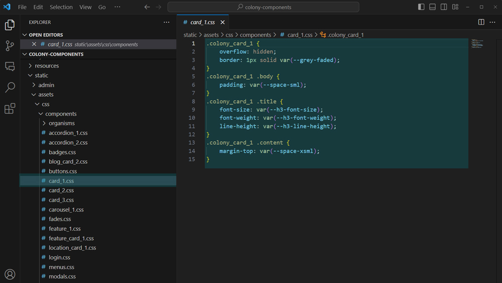
CSS should be written in a natural order with statements ordered from the outside of the component to inside and from top to bottom. Where items are on the same level from left to right. The Component Class is paired with the Internal Classes to target individual elements and limit the styles to only the component.
.colony_card_1 {
    overflow: hidden;
    border: 1px solid var(--grey-faded);
}
.colony_card_1 .body {
    padding: var(--space-sml);
}
.colony_card_1 .title {
    font-size: 1.5rem;
    font-weight: 700;
    line-height: 1.3em;
}
.colony_card_1 .content {
    margin-top: var(--space-xsml);
}
Responsive CSS should be included below the main CSS with media queries ordered from largest breakpoint to smallest. Within each media query statements should be ordered as above.
Variables
Where possible all references to color and spacing should use Framework variables in place of absolute values. Colors should utilise only the monochrome variables preset in the Framework. Spacing should utilise the 5 utility spacing variables
.colony_card_1 .body {
    background: var(--grey);
    padding: var(--space-sml);
}
CSS Spacing
Where possible elements should be vertically spaced by using margin-top or padding-top. Declaring spacing of all elements from the top makes adding, removing or customising the component simpler as the source of spacing is predicatable.
.colony_card_1 .content {
    margin-top: var(--space-xsml);
}
Javascript
There are less formal rules around Javascript as the options for functionaity are much more wide ranging in scope. As a rule of thumb though any code should use intuitive, human readable variables, be self contained and not affect any elements outside of the target component. Aim for code that a developer with no prior knowledge of the component can easily pick up, read & even customise if neccessary.
Component Javascript should be wrapped in it's own document.ready function.
$(document).ready(function(){
    $('.open_colony_modal').click(function(){
        var videoSrc = $(this).attr('videoSrc');
        $('.colony_modal').fadeIn();
        $('.colony_modal .video iframe').attr('src', videoSrc);
    });
    $('.colony_modal .background, .colony_modal .close').click(function(){
        $(this).parent().fadeOut();
        $('.colony_modal .video iframe').attr('src', '');
    });
});
Adding Components
A look at how to add new components into the Components repository.
Add HTML
Add the HTML for the component as a Partial in the layouts/partials folder. Name the .html file as per the component and store within sub folders for the relevant component type and component category.
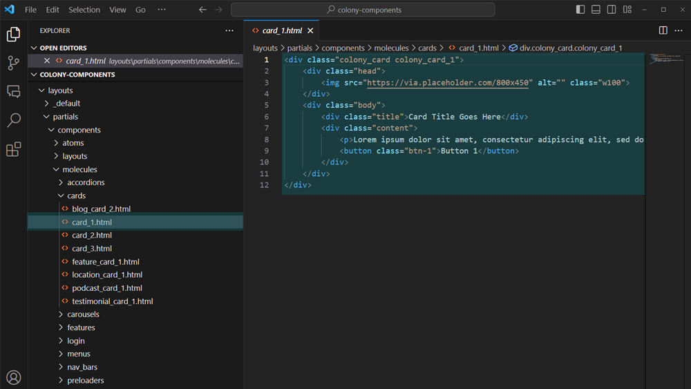
Add a corresponding Shortcode in the layouts/shortcodes folder referencing the partial.
{{ partial "/components/molecules/cards/card_1.html" . }}
Add Supporting Files
Save any supporting files within the relevant sub-folders in static/assets.
Add Preview Image
Save the preview image within the relevant sub-folders in assets/img/preview.
Create Component Tile
Create a markdown file within the relevant sub-folders in content and configure the attributes to create a tile.
---
draft: false
status: live
id: 5e5fbeed-7b7e-4868-82ff-94a4455c7177
componentType: molecule
componentCategory: cards
title: Card 1
summary: Lorem ipsum dolor sit amet, consectetur adipiscing elit, sed do eiusmod tempor incididunt.
img: img/previews/molecules/cards/card_1.png
html: components/molecules/cards/card_1
css: [{
    name: "card_1",
    link: "/assets/css/components/card_1.css"
}]
installation: [
    {
        type: download,
        item: card_1.css,
        downloadLink: /assets/css/components/card_1.css,
        saveLocation: static/assets/css/components/
    },
    {
        type: import,
        link: '@import "components/card_1.css";'
    }
]
---
Attributes
draft - boolean | true hides tile | false shows tile
status - string | live creates active tile | development creates placeholder tile.
id - string | UUID using version 4
componentType - string | atom, molecule, organism, layout, snippet.
componentCategory - string | any valid category (lowercase).
title - string | name of the component
img - string | filepath of the preview image
html - string | filepath of the partial
css - array | objects containing file name and filepath in assets
js - array | objects containing file name and filepath in assets
json - array | objects containing file name and filepath in assets
installation - array | objects containing installation options.
Supporting Files
Optionally add supporting CSS, Javascript & JSON files (can add none, one or multiple of each).
css: [{
    name: "xxxxxxxxxxx",
    link: "/assets/css/components/xxxxxxxxxxx.css"
},
{
    name: "xxxxxxxxxxx",
    link: "/assets/css/components/xxxxxxxxxxx.css"
}]
js: [{
    name: "xxxxxxxxxxx",
    link: "/assets/js/components/xxxxxxxxxxx.js"
}]
json: [{
    name: "xxxxxxxxxxx",
    link: "/assets/json/components/xxxxxxxxxxx.json"
}]
Installation
Add installation instructions, the copy HTML instruction is added automatically.
installation: [
    {
        type: download,
        item: xxxxxxxxxxx.css,
        downloadLink: /assets/css/components/xxxxxxxxxxx.css,
        saveLocation: static/assets/css/components/
    },
    {
        type: import,
        link: '@import "components/xxxxxxxxxxx.css";'
    },
    {
        type: download,
        item: xxxxxxxxxxx.js,
        downloadLink: /assets/js/components/xxxxxxxxxxx.js,
        saveLocation: static/assets/js/components/
    },
    {
        type: script,
        script: '<script src="/assets/js/components/xxxxxxxxxxx.js"></script>'
    },
    {
        type: classes,
        text: Add one of the classes below to xxxxxxxxxxx,
        classes: [
            class_name_1,
            class_name_2
        ]
    },
    {
        type: text,
        text: Enable 'xxxxxxxxxxx' in /data/configScripts.json
    },
    {
        type: library,
        library: xxxxxxxxxxx
    },
    {
        type: link,
        vanity: xxxxxxxxxxx,
        url: xxxxxxxxxxx
    }
]
